Animators by day Animation teachers by night.

Wednesday, January 25, 2006

Future spline casts?

Just a question, what types of thing would you like to hear about in possible future pod casts? We have collectively decided to not talk about PIXAR on our blog because the site is not about PIXAR but anything animation related is fair game. So let us know and maybe we can make some stuff happen.

-Dr. Stephen G.

Sunday, January 22, 2006

To Spline or Not to Spline? - A Podcast


Our First Podcast!

I was listening to The Animation Podcast the other day with Eamonn Butler, and he was talking about how he only uses linear knots to animate with. This has been a point of debate among animators since I have been in the industry. I also knew a guy who animated arms with IK always on. We thought he was crazy...Anyway, I thought I would ask around and see what some of the other Docs said. So, presenting our first, and maybe last, podcast. I dont think there is a definite answer and I think both methods have merrit. Especially if you are going for a certain style. So, here it is... I may have gotten carried away with garage-band a bit...


Spline or Line

ps. safari may open it as a text file. Right click to download. Usually plays great in itunes...

Wednesday, January 18, 2006

Demo Reel Tips...


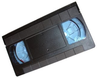
A lot of people ask what a good demo reel should have on it. I guess it depends on what job you are going for. At a studio like the one we work at, we like to see really good acting skills. What is good acting, you might say? Well, we can get into that another time, but it has to do with a lot of things. Are your acting choices good? Are you using too many gestures. Does your facial animation have nice design? Does the character have the right physicality? Are you good at polishing? How is the timing? All these things and more come into play when reviewing acting shots. I think its also important to have some good physical stuff. People say, put a run and a walk on the reel. I like this idea, but show me a walk with character, not just a canned one. When you look at work, you want to find something special about it. Something that catches your eye and makes you want to see it again. Always put your really good stuff in the beginning, fill the middle and end with a great shot. Keep the titles simple and clean on the head and tail of the reel. If you have your reel on VHS, make sure its cued up. I personally like DVD format the best. This contradicts the image i put up. Plus, you can put other stuff like your drawings and resumes on it. Music is good, just make sure you lower the level when you have a shot with dialogue.

So Remember:

Name over black
Great Work first
Filler (unless all your work is stellar)
Leave them wanting more
Titles with your contact info


hope this helps

-Andrew

Wednesday, January 11, 2006

More Sharing


I'm sure you have seen this. So looking through our replies I'll sometimes click around and check out other people's blogs and sometimes you stumble upon some great stuff. The other day I stumbled upon Matt Williames blog, and hey it's pretty cool. So check it out.

Got nothing new, just something to share.


I was talking to a friend of mine last night and he mentioned this new blog that he and some fellow story artists put up. Looks like it could be fun, and being able to see anything from these amazing story artists is a real treat.

Story Boredom

Wednesday, January 04, 2006

Overlapp in Style...


When ever I get to the part of the scene where I am getting into overlap and follow thru, it gets me excited. It means that I am almost done with the shot and I am adding the last details. These details are so important to make it look correct. In the case of animating the antenna on a character, as in A Bugs Life, the antenna really helped keep the character alive. The were not just floppy, they had to be animated to reflect the attitude of what the character was feeling. I also enjoy doing small details on characters when they hit a pose quickly. Jiggle Settles for instance. Doug Sweetland, a Toy Story veteran, was well known for having these intricate jiggle settles on his characters. It added a sense of hyper realism. It also became a stylistic choice. As you animate for years, you start to develop things that set your work from others. So when you have to animate those floppy ears, or jiggle the fatty parts of your characters, do it right, and do it with style. As the industry turns Hi-Def, all these small details are going to be easier to see. Our life as animators is getting tougher because of how high rez everything is, and how stylistic the characters are. One thing to always note is where you eye will be directed. As animators, we look at our shot over and over, but most viewers see it only a handful of times. Its important to get the overlapp right, but more important to spend your time in the areas that count.

Some well done stylistic overlapp that I can remember off the top of my head is:

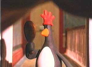
The Penguin in the Wrong Trousers (the red rubber glove on his head)
Madagascar had some amazing tail animation on the lemurs king
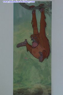
Jungle Book (any of Milts work on King Louie)
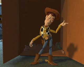
Woody coming out of the box in TS2

I'd love to get people to site some other great examples

There are so many. Sometimes I choose to let the computer figure out certain aspects of the overlapp. Its hard to go in and exaggerate when you are burnt out, but it can make all the difference.

I forgot who said it, but great overlapp can turn a mediocre scene into a mediocre scene with great overlapp.

-Andrew